
A sampling of work - including maps, infographics, and logos
+ Visit /interactive for dynamic visuals
Featured


Interactive map showing bikeshare and scooter systems in the U.S. from 2015 to 2019. Basemap created using Mapbox Studio and interactivity created using Mapbox GL JS.
View this map on my Github site here
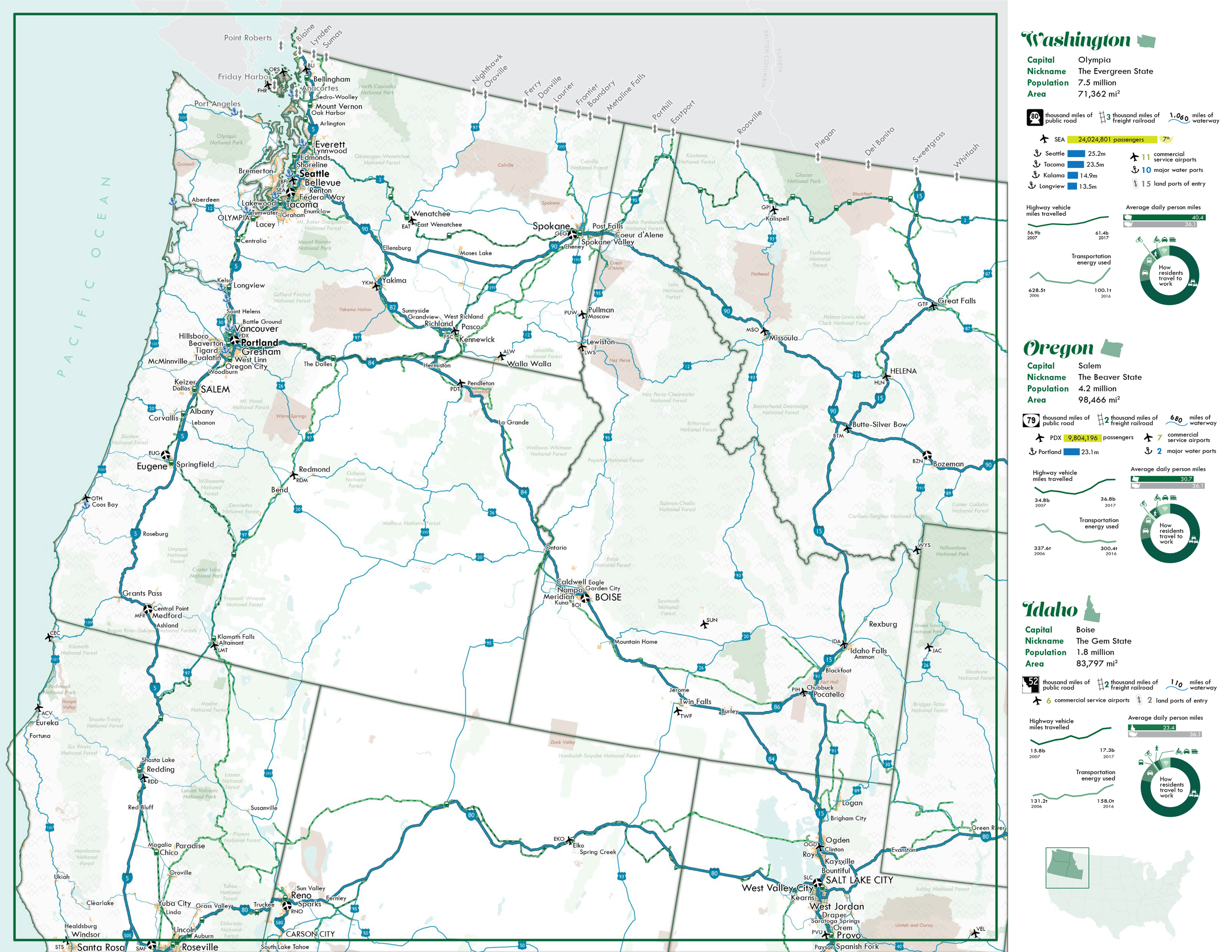
An early draft page for the Pacific Northwest region of the National Transportation Atlas, with baseline statistics about transportation in Washington, Oregon, and Idaho
Created for a final class project for Geovisualization/Cartography and Python Programming graduate courses. Justification and more on this piece featured on /writing.
Map visualization showing the travels of the ship Queen Mississippi every day in 2017. Basemap created in Mapbox Studio and interactivity created in Mapbox GL JS.
Click through for map showing average annual truck traffic in the U.S. for 2015 and estimated for 2045; basemap created in Mapbox Studio and interactivity programmed using Mapbox GL JS
Similar live demo here on my Github page
1/5 continental wall maps created for reference purposes
Select Transportation Infrastructure of the United States is the front side of a 34” x 44” foldable wall map produced for the Bureau of Transportation Statistics at the U.S. Department of Transportation. This map is updated every other year, showing current essential infrastructure for the major modes of transportation in the U.S. As of January 2019, approximately 4000 copies of the wall map have been printed for distribution at conferences and USDOT events.
A quick visualization connecting energy, agriculture, and transportation for use on social media to promote release of updated datasets for the National Transportation Atlas Database
USDOT Twitter map graphic using newly updated data from the National Transportation Atlas Database (NTAD)
This map, created for a presentation to the Metropolitan Washington Council of Governments, uses general transit feed specification (GTFS) data from the National Transit Map to visualize participating transit agencies in the Washington, DC metro area.
Map of the area surrounding Golden Spike Historical Site, where the last (or “golden”) spike was placed to complete the Transcontinental Railroad in 1869, for use during its sesquicentennial celebration
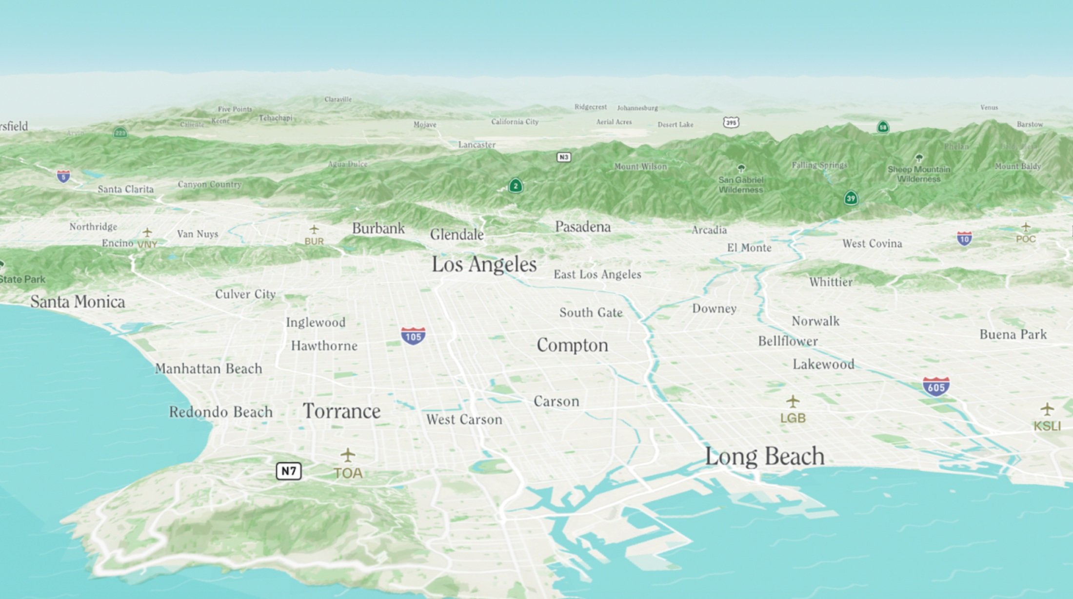
A simple, modern map showing all roads in the Washington area, with labels to help orient the reader
Hand-drawn and -painted map of Iceland following a trip in 2018. Contours generated from digital elevation models in ArcGIS, lines drawn with Sakura Pigma Micron pen, painted with (unintentionally very saturated) watercolors.
Last-minute map for a presentation on stops or stations serving more than one mode of transportation in the Boston area
Transportation Fatality Rate per State is a multidimensional cartogram showing both the number and rate of highway fatalities in each state for 2017. Most cartograms illustrate one phenomenon at a time, whereas here both the size and hue of each hexagon represent a unique value. This map is part of the reverse side of the Transportation Geography of the United States wall map.
1/5 continental wall maps created for reference purposes